The Tarot Reveals the Z Pattern:
Users first look at the top, then move their eyes to the bottom left corner. They repeat this process, creating a Z-shaped eye movement pattern.
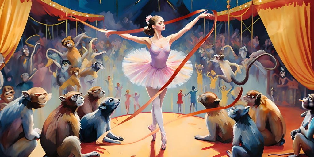
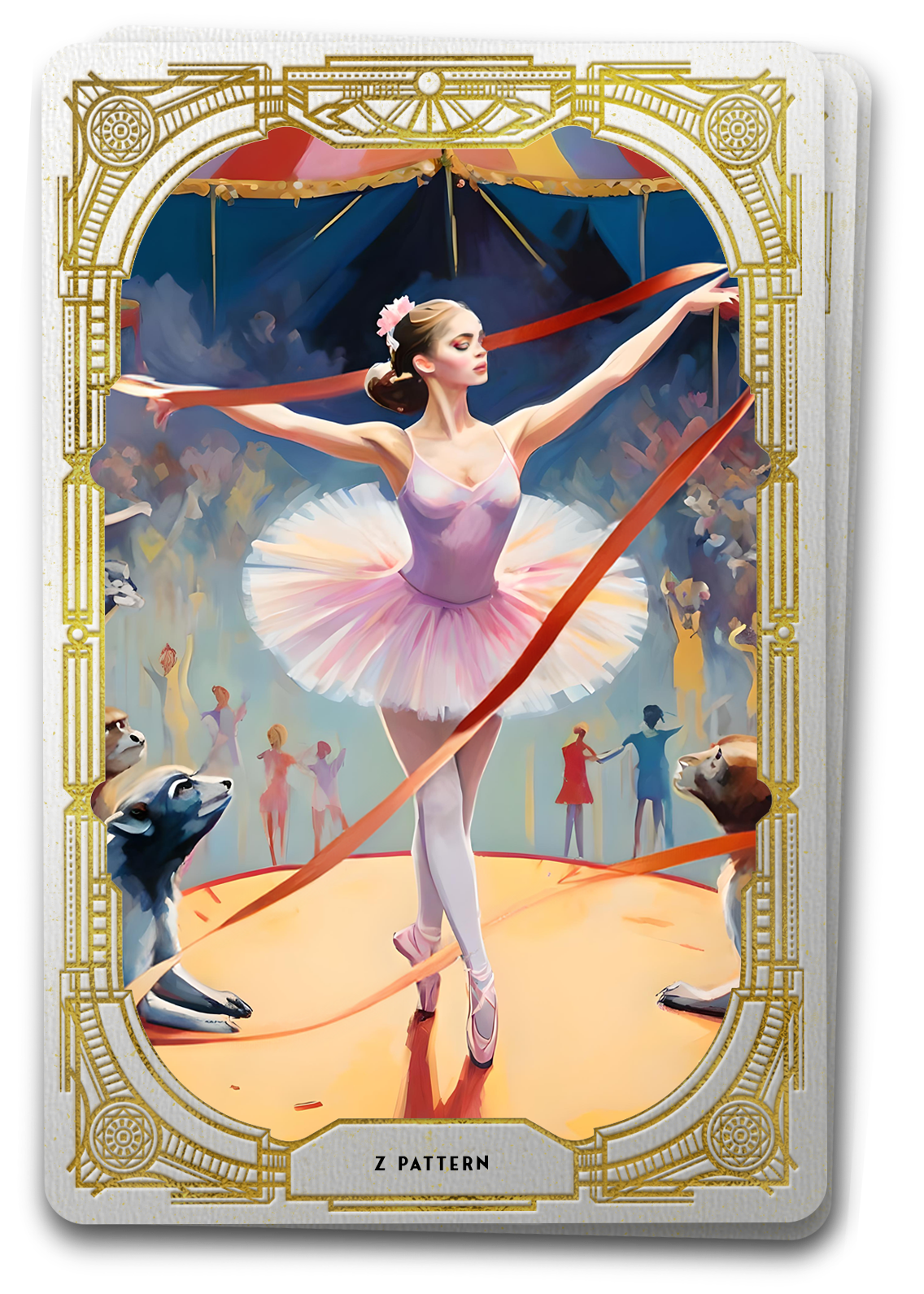
As the choreographer orchestrates a mesmerizing dance performance, the dancer moves with purpose, guiding the audience’s attention seamlessly across the stage. In the world of user experience design, the Z Pattern serves as a choreographic blueprint for visual storytelling. Just as dancers follow a structured routine, users navigate digital interfaces in a predictable Z-shaped pattern, effortlessly gliding across mixed content types like text and images.
The Choreography of Z Pattern Design
Through disciplined user experience design, where every pixel holds the potential to captivate, the Z Pattern emerges as a choreographic masterpiece. This design principle, akin to a dance routine, is especially effective for applications featuring a balanced mix of content types – a canvas where text and images perform a harmonious duet. Users, like the attentive audience, follow a predictable Z-shaped path, guided by the rhythm of carefully placed visual elements.
The Z Pattern’s inception lies in the intersection of psychology, eye-tracking studies, and the fundamental principles of visual hierarchy. While the concept itself is more implicit than explicit, its recognition gained prominence through the evolution of web design principles. Designers began noticing that users naturally followed a specific eye movement pattern when engaging with content-rich interfaces. This realization led to the formalization of the Z Pattern as a design strategy to optimize user attention and comprehension.
The concept gained widespread recognition as designers started implementing it in websites, applications, and various digital interfaces. Its effectiveness in guiding users through content-rich pages, especially those with a mix of text and images, has made it a staple in UX design practices.
The Z Pattern aligns with the science of eye movement and visual perception. Human eyes naturally follow a path that maximizes both efficiency and comprehension. When presented with information, our eyes tend to move in a Z-shaped trajectory, starting from the top-left corner and concluding at the bottom-right corner. This natural movement stems from a combination of factors, including cultural reading habits (left-to-right, top-to-bottom in many cultures) and the structure of our eye muscles.
As users scan a page, the Z Pattern allows for an efficient consumption of information. The initial horizontal movement at the top accommodates the placement of crucial information such as headlines or menu bars. The diagonal sweep toward the left bottom corner ensures the exploration of images or multimedia elements, creating a visually engaging experience. The final horizontal movement at the bottom provides closure, ensuring users feel they’ve covered the entirety of the content.
Practically, the Z Pattern is a valuable tool for designers crafting interfaces with a balanced mix of text and images. Consider a news website where headlines, menu options, and featured images collaborate seamlessly. Users, adopting the Z Pattern, effortlessly navigate through the headlines at the top, explore the main content in the center, and conclude with supplementary details at the bottom.
To leverage the Z Pattern effectively, designers must strategically place key content along this visual trajectory. The main heading, critical navigation options, and captivating visuals should align with the natural flow of the Z, ensuring users engage with the digital content in a way that feels both instinctive and engaging.
In the digital era, understanding and implementing the Z Pattern becomes a choreographic key to captivating user journeys. As designers embrace the art and science behind this concept, they unlock the potential to guide users through an orchestrated dance of digital storytelling.
Practical Application of the Z Pattern in UX Design
Homepage Layout
- Top-Left Header: Place the main heading or menu bar at the top-left corner, initiating the Z Pattern with crucial information.
- Diagonal Sweep to Center: Arrange engaging visuals and multimedia elements along the left-bottom corner, ensuring users follow a natural diagonal path.
- Bottom-Right Closure: Conclude the Z Pattern at the bottom-right corner with supplementary details or additional calls-to-action.
News and Blog Websites
- Headlines Placement: Position headlines at the top to catch users’ initial attention, aligning with the first horizontal movement of the Z.
- Images and Media: Integrate images and multimedia content along the left-bottom corner, facilitating the diagonal sweep and enhancing visual engagement.
- Supporting Details: Provide additional information, related articles, or navigation options at the bottom-right, completing the Z Pattern.
Product Pages:
- Product Headline: Feature the main product headline or key details at the top-left, initiating the Z Pattern with essential information.
- Product Imagery: Place high-quality images and multimedia elements along the left-bottom, inviting users to explore the product visually.
- Additional Information: Include supporting details, specifications, or related products at the bottom-right for a comprehensive user journey.
Landing Pages:
- Hero Section: Utilize the hero section at the top for impactful visuals or key messages, aligning with the initial horizontal movement of the Z.
- Visual Storytelling: Incorporate a storyline through images or multimedia content along the left-bottom, encouraging users to follow the Z Pattern.
- Conversion Elements: Position conversion elements, such as forms or calls-to-action, at the bottom-right to guide users towards desired actions.
Mobile App Onboarding:
- App Logo/Header: Feature the app logo or header at the top-left, initiating the Z Pattern and providing a recognizable starting point.
- Visual Tutorials: Introduce visual tutorials or interactive elements along the left-bottom, aiding users in understanding app features through a natural diagonal flow.
- Additional Resources: Include links to help, FAQs, or additional resources at the bottom-right, completing the Z Pattern and offering support.
eCommerce Platforms:
- Category Navigation: Display category navigation or menu options at the top-left, setting the stage for users’ initial navigation.
- Product Showcase: Showcase featured products or images along the left-bottom, inviting users to explore the product offerings in a visually appealing manner.
- Checkout and Recommendations: Place checkout options or related product recommendations at the bottom-right, concluding the Z Pattern with conversion-focused elements.
By applying the Z Pattern strategically in various design scenarios, UX designers ensure that users engage with digital interfaces in a natural and intuitive way. This choreographic approach optimizes visual storytelling, providing users with a seamless and captivating journey through mixed content types.


