
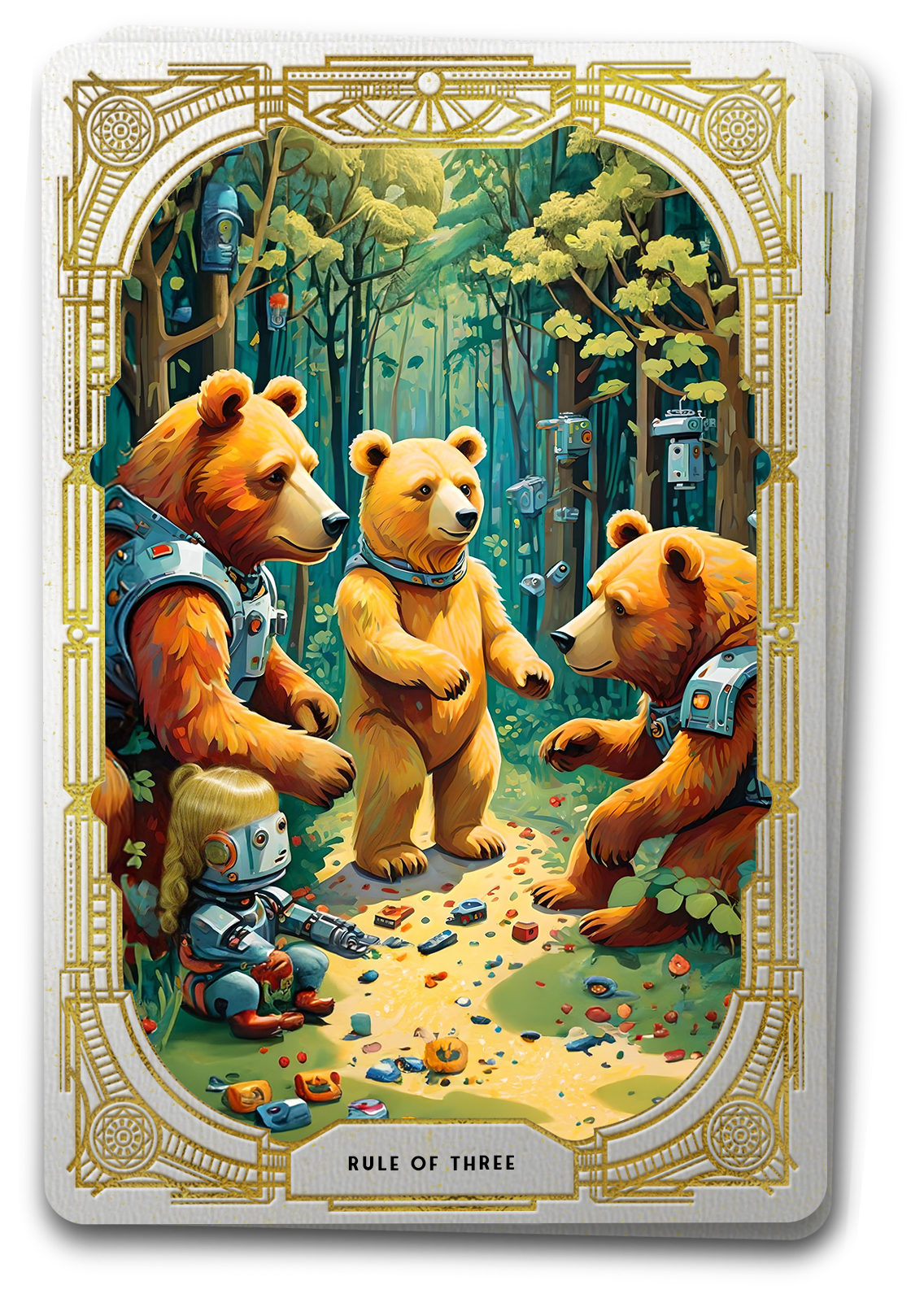

The Tarot Reveals the Rule of Three:
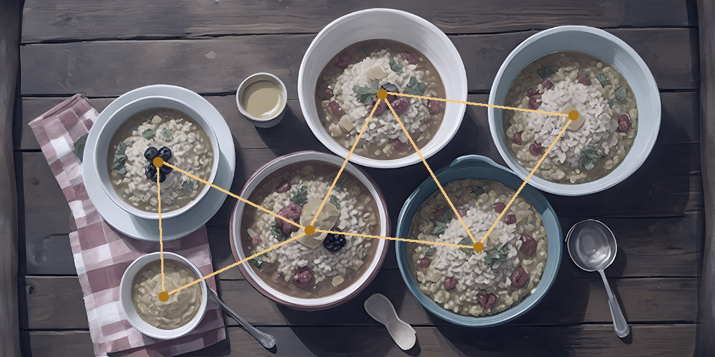
A group of odd numbers is pleasing to the eye with a grouping of three being the most pleasing of all.
When Goldilocks entered that fateful cottage, it didn’t take long for her to find all the things that were “just right.” Much like our discerning explorer, the Rule of Three beckons users into a world where odd-numbered groupings, especially the magic trio, create visual arrangements that are comfortable and pleasing. As Goldilocks navigated the Bears’ domain, she encountered groupings that were neither too crowded nor too sparse, the Rule of Three her guide, orchestrating a visual feast much like the perfectly balanced bowl of porridge. Yet it was not just the collection of items that made hers an interesting journey, but also their organization within the cottage. The Rule of Thirds divides the proverbial cottage, or digital canvas, into a structured grid, guiding Goldilocks, and designers alike, in the strategic placement of elements to promote discovery and balance.
Three is the Magic Number
Guided by the Rule of Three, the “Magic Trio” refers to the powerful and aesthetically pleasing arrangement of elements in groups of three. This principle posits that odd-numbered groupings, particularly the number three, hold a special visual appeal and balance. In the context of UX design, the “Magic Trio” involves organizing and presenting design elements, such as typography, images, or content blocks, in sets of three to create compositions that resonate with users.
Much like the inherent appeal found in the simplicity and completeness of a triangle, the “Magic Trio” captures the user’s attention and provides a sense of harmony. This arrangement is thought to be more dynamic, interesting, and memorable than even-numbered groupings. The concept extends beyond visual aesthetics; it aligns with cognitive patterns, making information processing and user engagement more intuitive.
In essence, the “Magic Trio” is a visual storytelling technique that leverages the psychological preference for odd-numbered arrangements, creating digital experiences that are not only visually pleasing but also resonate with the natural way users perceive and engage with information. It’s a design enchantment that – like a comfortable chair, a squishy bed, and a warm bowl of porridge – draws users into a world where the power of three shapes the narrative of user experience
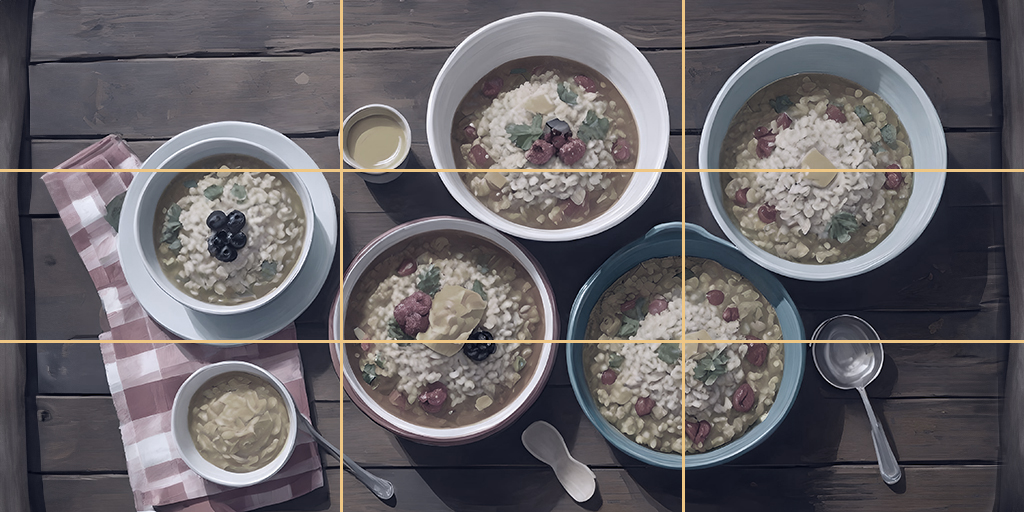
Yet Goldilocks stumbles upon another guide in her journey of discovery – one that transcends object groupings and helps her focus on the broader layout of the cottage. The Rule of Thirds divides the canvas into a structured grid, offering a map for strategic placement. Where the Rule of Three orchestrates delightful trios, the Rule of Thirds becomes the cottage blueprint, guiding the Bears in placing essential elements with strategic precision for Goldilocks to find.
The Rule of Thirds invites designers to position important elements at the intersections, creating a flow that mirrors the bears’ furnishings in their fairy-tale home. This strategic grid becomes a map for visual hierarchy, guiding the user’s gaze to focal points that are both significant and compelling. Interface layouts, image compositions, and responsive design all find their rhythm within this grid, creating a visual ballet that ensures an engaging and balanced experience.
A cornerstone to this principle, the 2/3-to-1/3 ratio is a powerful compositional guideline for UX and visual design. The Rule of Thirds divides an image or a canvas into a grid of nine equal parts, created by two equally spaced horizontal lines and two equally spaced vertical lines. The focal points are where these lines intersect, forming four key points on the canvas.
Specifically, this principle promotes the idea of placing important elements within the two outer thirds of the composition while leaving the remaining one-third as a complementary or negative space. This asymmetrical arrangement is believed to be visually appealing and creates a dynamic balance that draws the viewer’s attention to specific areas of the image.
In practice, key elements, such as the main subject of a photograph or a crucial interface element in UX design, are often positioned along the lines or at the intersections of the grid, falling within the 2/3 portion. The remaining 1/3 portion serves to provide breathing space or background, contributing to an overall balanced and aesthetically pleasing composition.
The 2/3 to 1/3 ratio is a useful guideline for photographers, graphic designers, and UX designers, providing a structured framework for creating visually engaging and well-balanced compositions within the context of the Rule of Thirds.
While the Rule of Three and the Rule of Thirds may share a common goal, they each bring their unique flavor to the table of UX design. The Rule of Three, like Goldilocks, is focused on the arrangement of elements within groups, creating interesting trios that resonate with the user’s visual palate. Meanwhile, the Rule of Thirds directs attention to the strategic placement of those elements within a broader canvas, ensuring the overall composition is a captivating visual narrative.
In essence, the Rule of Three and the Rule of Thirds unfold as the Goldilocks and the Three Bears of UX design – a trio of principles that, when combined, crafts digital experiences that are “just right.” As Goldilocks, the digital explorer, navigates through the interface, she finds a visual feast that captivates the eye, much like the delightful harmony found in a timeless fable. The Rule of Three and the Rule of Thirds, hand-in-hand, guide the design narrative, creating a visual tale where each pixel finds its perfect place, just like Goldilocks in the bears’ cottage
Practical Applications of the Rule of Three and Rule of Thirds in UX Design
The Rule of Three:
- Initial Engagement: Structure textual content with a primary, secondary, and tertiary font sizes – think Header, Subheader, and Content. This creates a clear hierarchy, making the information more digestible for users.
- Visual Groupings: Arrange images, buttons, or content blocks in groups of three to enhance visual balance and facilitate user engagement. Trios create a rhythm and simplicity that aids in user comprehension.
- Color Palette Trio: Design color schemes using a trio of primary, secondary, and tertiary colors. This approach allows for a visually appealing and balanced palette without overwhelming users with too many colors.
- Information Chunking: Organize content into groups of three for easier comprehension. Whether presenting features, benefits, or key points, this grouping structure aids in user understanding and retention.
- Action Arrangement: Present related actions in groups of three. This helps users quickly identify and choose from available options, streamlining the user interface and improving navigation
The Rule of Thirds:
- Visual Hierarchy: Position important elements, such as logos or primary navigation, along the lines or at the intersections of the Rule of Thirds grid. This ensures a strong visual hierarchy that guides user attention.
- Image Composition: Align key features, focal points, or important elements with the grid lines or intersections to create visually appealing and balanced images. This technique is particularly relevant in showcasing products or interface components.
- Interface Layout: Place crucial interface elements, like call-to-action buttons or key information, along the grid lines to optimize user engagement. This helps create a balanced and aesthetically pleasing layout.
- Responsive Design: Apply the Rule of Thirds when designing for various screen sizes. Ensuring that important elements align with the grid on both small and large screens helps maintain a visually pleasing and effective layout.
- Whitespace Implementation: Use the remaining space in the 1/3 portion as whitespace or negative space. This provides visual breathing room and prevents the design from feeling cluttered, contributing to a more focused and user-friendly experience.