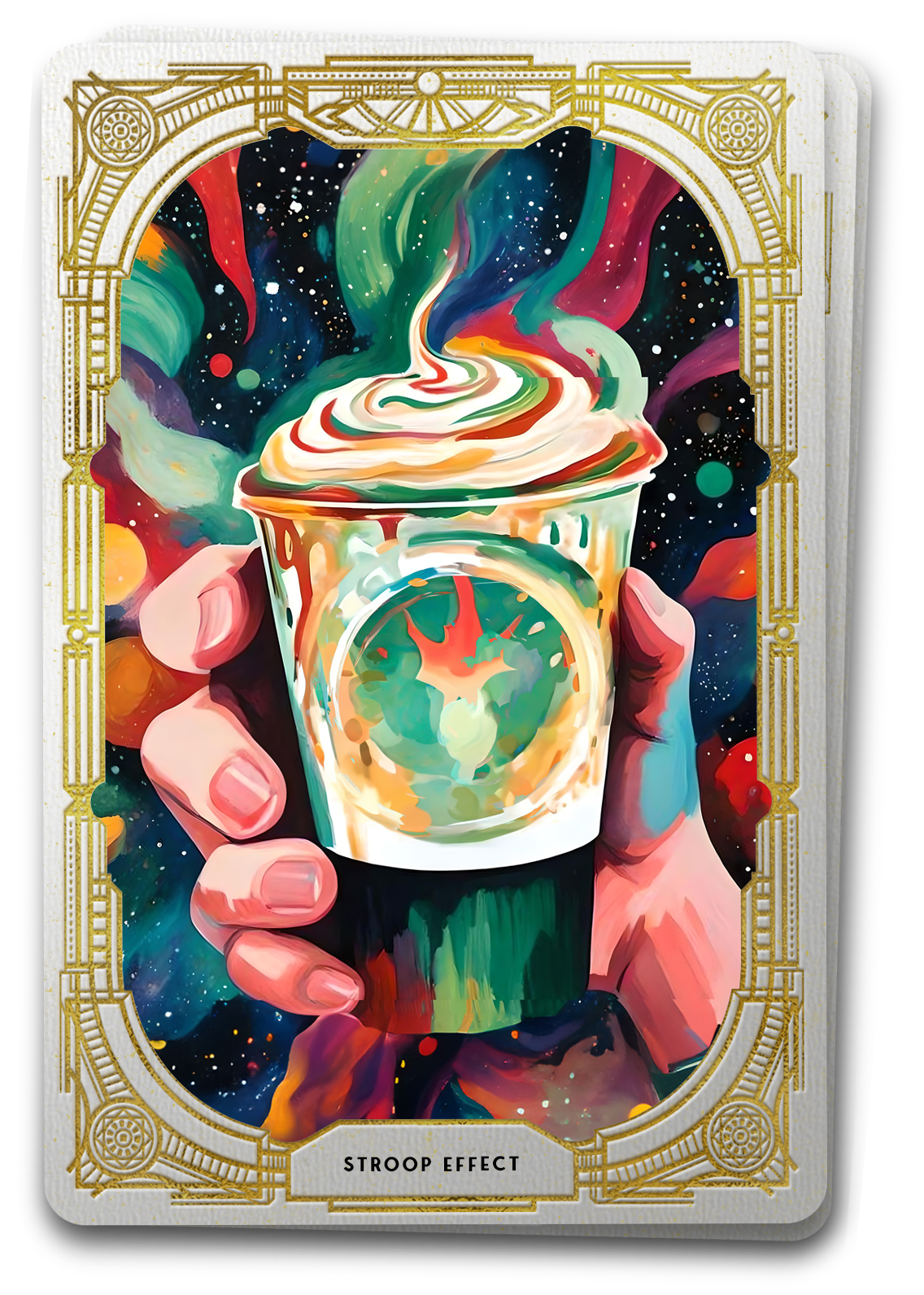

The Tarot Reveals The Stroop Effect:
When something familiar is presented in an unexpected way, your brain takes longer to adjust.
Imagine stepping into your favorite coffee shop, eager to savor the familiar richness of your go-to brew. You anticipate the comforting aroma, the routine exchange with the barista, and the cozy ambiance. However, as you receive your cup, something is amiss – the familiar coffee is flavored in an unfamiliar way, challenging your ingrained expectations. Where you might have ordered a latte, but tasted a mocha, makes you stop and question if you’re actually tasting what you think you’re tasting. The unexpected twist jolts your senses, creating a moment of cognitive dissonance. This is the Stroop Effect. In user experience design, the Stroop Effect introduces a twist to the familiar interplay of colors, text, and function, forcing us to explore the cognitive complexity that arises when the expected takes an unexpected turn.
Unraveling the Cognitive Interference
Though some early German studies predate this, John Stroop first introduced the concept of this cognitive challenge in English the 1930s. In his seminal study, participants were presented with color words (e.g., “red,” “blue”) written in incongruent ink colors. For instance, the word “red” might be written in blue ink. Participants found it challenging to quickly identify the ink color while suppressing the automatic reading of the word, showcasing the conflict caused by conflicting stimuli. Stroop’s findings revealed the inherent difficulty in suppressing automatic reading processes, laying the groundwork for understanding the greater cognitive interference.
Picture the Stroop Effect as a cognitive puzzle where conflicting attributes, such as incongruent color, text pairings, or expected functions create mental disharmony. In UX design, this phenomenon manifests when color choices clash with intended messages or when a site function produces an unexpected action. This cognitive dissonance influences user decision-making processes. Users may hesitate or experience a moment of confusion when confronted with unexpected choices, disrupting the flow of their interactions. The resulting internal conflict can lead to indecision, affecting the efficiency and effectiveness of user engagement within the interface.
So by recognizing how conflicting associations induce mental discomfort, designers can implement strategies that align with user expectations – and doing so, pave the way for a seamless and engaging user experience.
Connecting the Stroop Effect to Other UX Concepts
Mental Models
Mental models represent users’ internalized beliefs and expectations about how a system should behave. The Stroop Effect aligns with mental models as it demonstrates how users anticipate certain associations based on prior experiences. Designers need to consider these expectations to create an interface that aligns with users’ mental models, reducing cognitive dissonance and enhancing usability. To do this, design interfaces that adhere to widely accepted conventions, aligning with users’ mental models and reducing the likelihood of unexpected associations.
Cognitive Load
The mental effort required to process information is commonly referred to as the Cognitive Load – e.g. the extra work your brain has to do to recognize that there is mocha in your latte. The Stroop Effect, by introducing conflicting concepts, can increase cognitive load as users navigate unexpected associations. Understanding this relationship is crucial for designers to optimize interfaces, ensuring that the cognitive load imposed by the Stroop Effect is minimized for a smoother user experience. Strive for clarity in design, optimizing color choices and simplifying functions to minimize cognitive load and enhance overall usability.
Accessibility
Accessibility in UX design aims to create inclusive experiences for users with diverse abilities. The Stroop Effect has implications for accessibility, especially for users with color vision deficiencies. Designers must consider color contrast and consistency to make interfaces accessible to all, aligning with principles of inclusive design. To help adhere to accessibility standards, ensure sufficient color contrast while providing alternative cues for users with color vision deficiencies.
Attention and Information Hierarchy
The Stroop Effect can impact users’ attention allocation and the perception of information hierarchy. Designers must carefully consider color usage to guide users effectively through an interface. Inconsistent color-text associations and font sizes may divert attention and disrupt the intended hierarchy, leading to user confusion. Use color and fonts consistently to emphasize important UI elements, guiding users’ attention and maintaining a clear information hierarchy.
User Feedback
User feedback is a cornerstone of UX design, providing insights into user experiences and potential issues. The Stroop Effect, influencing user perceptions, can be identified through user feedback. Incorporating user input helps designers iterate on interfaces, making adjustments to mitigate the impact of cognitive dissonance. Implement feedback mechanisms to collect user insights, identifying instances where the Stroop Effect may be causing confusion, and iteratively improve design elements.
Emotional Design
Emotional design focuses on creating user experiences that evoke specific emotions. The Stroop Effect, by influencing color-driven emotional responses, underscores the importance of aligning color choices with intended emotional tones. Designers must consider the emotional impact of color to create resonant and engaging interfaces. Use color intentionally to evoke desired emotional responses, ensuring alignment with the overall user experience goals.
By considering the connections between the Stroop Effect and fundamental UX concepts such as mental models, cognitive load, accessibility, attention hierarchy, user feedback, and emotional design, it’s not hard to see how color, text, and functional associations shape user experiences. As we step further into how this drives user behavior, we can unravel the impact of the Stroop Effect on user interactions, shedding light on the challenges and opportunities it presents in crafting seamless and engaging digital interfaces.
Impact on User Behavior
Color-Driven Emotional Responses:
- Challenge: Designers often use color to convey specific emotions.
- Effect: The Stroop Effect may disrupt intended emotional impact when users perceive incongruence between color and message.
Example: A “stop” sign rendered in calming blue instead of the expected red might lead to misinterpretation, impacting user decision-making.
Attention Allocation and Information Processing:
- Challenge: Highlighting important information using color.
- Effect: Users may struggle to allocate attention effectively when incongruent colors divert focus.
Example: Critical alerts highlighted in inconspicuous colors may lead to overlooking important information, affecting decision-making.
Readability in UI Elements:
- Challenge: Using color to emphasize UI elements.
- Effect: If color clashes with the intended emphasis, users may experience difficulty prioritizing or understanding the hierarchy of information
Example: An e-commerce website using a red font color for both promotions and error messages may lead to confusion, impacting users’ ability to discern important information.
Gamified Interfaces:
- Challenge: Integrating color gamification elements.
- Effect: Unexpected color schemes may impact the intended emotional response.
Example: In a gamified fitness app, using calming colors for intense challenges might create a mismatch between the intended and perceived experience.
As the journey through cognitive complexity unfolds, the Stroop Effect is a reminder that creating disharmony within a users established mental models will most likely produce undesired behaviors by increasing the cognitive load and disrupting the user’s natural expectations. Instead, UX designers, armed with an understanding of this cognitive phenomenon, become architects of an interface where the interplay of colors, text, and function create a seamless and enjoyable user experience. The tapestry of user perception becomes a canvas of cognitive harmony, where designers navigate the intricate maze to ensure clarity and engagement prevail.